Interview Evaluator Redesign
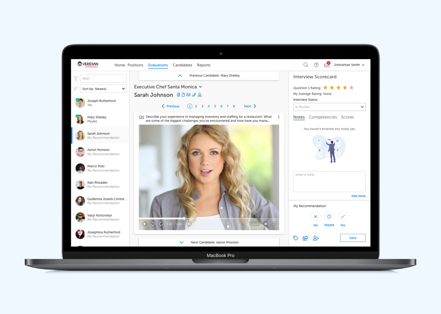
In 2016, our team took upon ourselves to redesign HireVue’s interview evaluation experience. The “Evaluator” as we referred to it, was the screen where a recruiter or hiring manager could go to watch video interviews uploaded by candidates. Being an enterprise SAAS company, the number of possible configurations was quite daunting and the amount of stuff that had been crammed into this single page app was pretty crazy.
That said, one of the first things I did was to gather data around what features were actually used as we hoped to simplify the experience by killing any old features that were rarely used. Much to my chagrin, there was nothing we could kill. 🙁
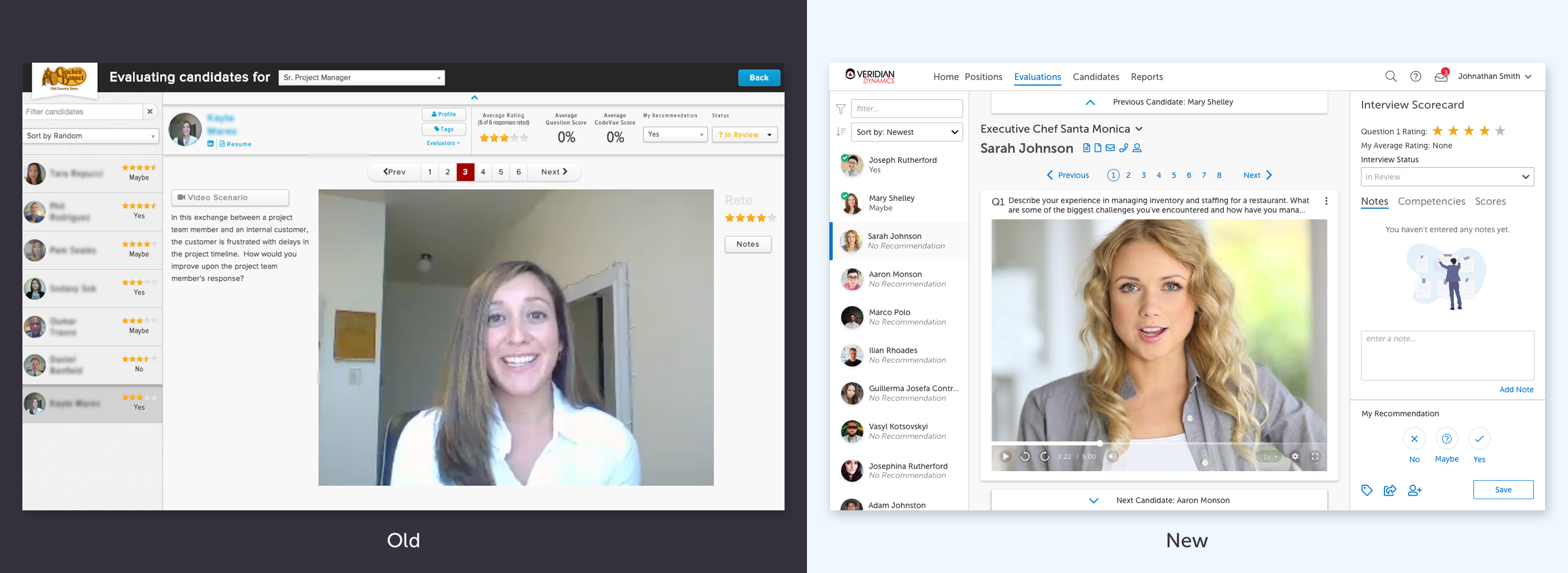
While we could not outright remove any of the features from the evaluator, we did learn much more about just how often and who was using what. We used this data to form plans for additional research we needed to better inform us about the use cases of various features. After many interviews, listening labs and observations, we began to see patterns and could identify common flows based on user personas and their jobs to be done.
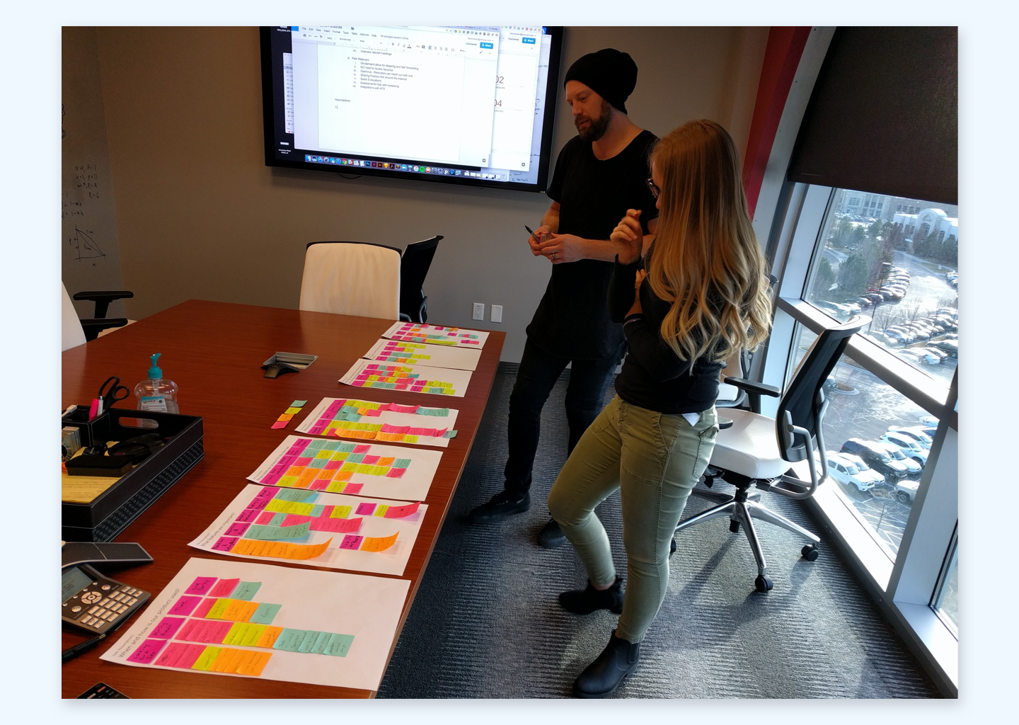
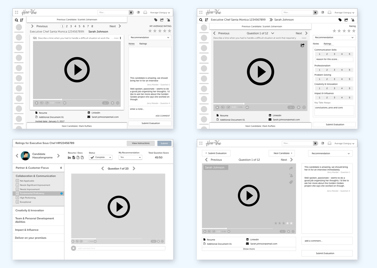
From this data, we began to build a fresh view of the correct information architecture and mock up possible layouts for the page. We tested these and found a layout that worked for our current use cases and that we felt would afford new use cases that we knew were already on the horizon.
Most Common Actions
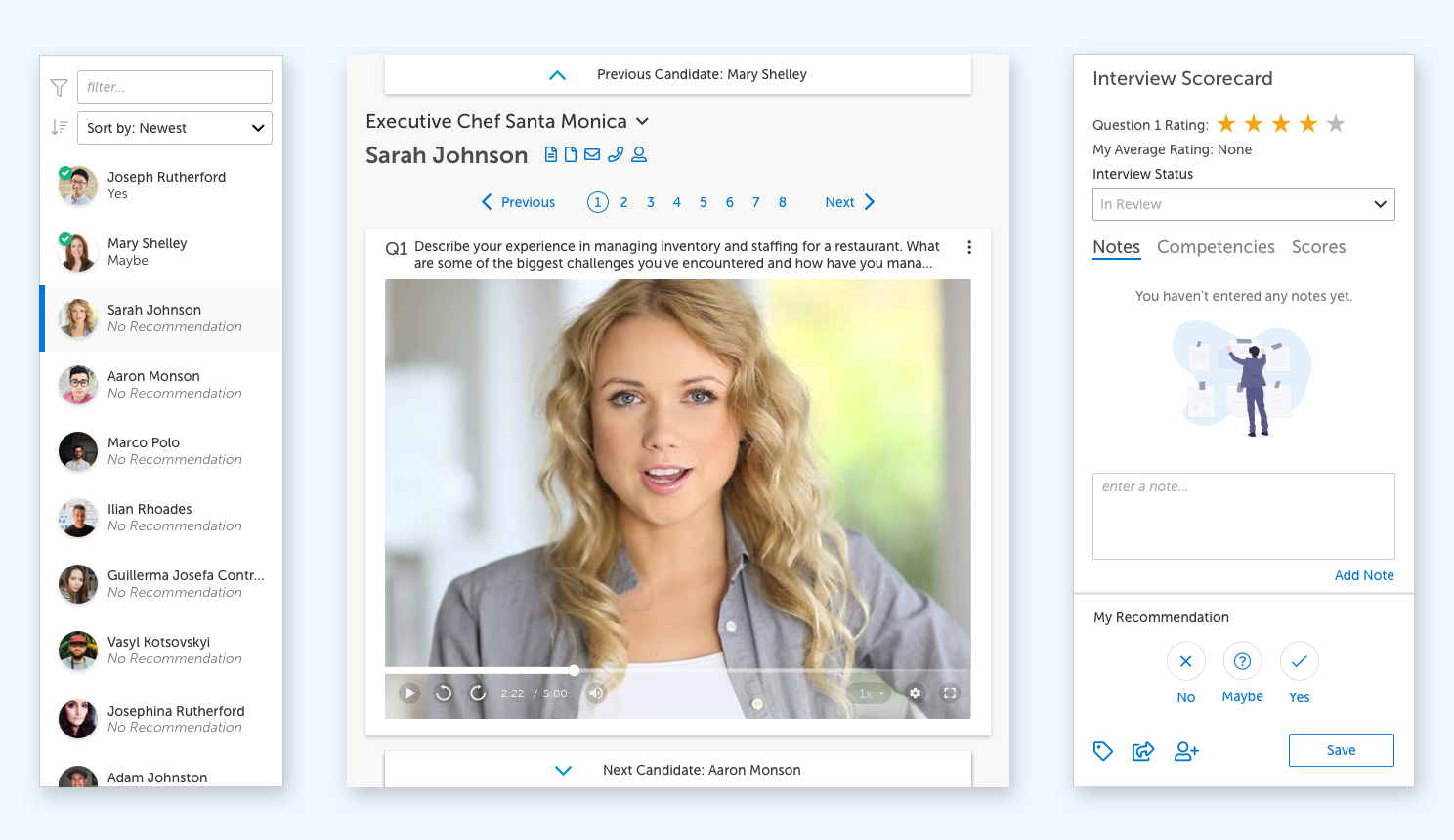
From our investigation, we learned that there were 3 common tasks that every user would regularly perform:
- Candidate selection
- Interview / Question Review
- Interview / Question Evaluation or scoring
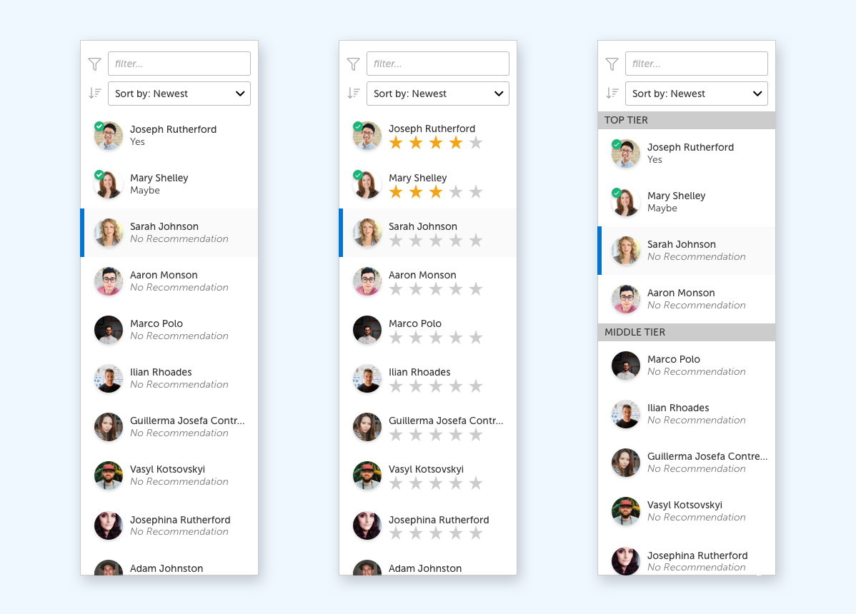
Based on this, we laid out the new UI into these three sections and iterated on the ideas. Ultimately, candidate navigation, filtering and selection would all be performed via a collapsible left hand navigation bar. The primary action that users spent the most time on, reviewing candidate responses, would occupy the majority of the screen in the middle. And finally, scoring or rating the interview and question responses along with all other data a hiring manager or reviewer might input, would be available via a panel to the right of the screen.
This layout allowed for clear focus and easy discovery of the auxiliary tools and features related to each core activity.
Less Common Actions
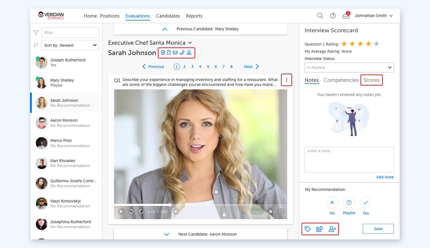
After finalizing all the primary user tasks, we then worked on finding the best home for the secondary and tertiary actions and tools that while not the most commonly used, were still vital for certain users to get their jobs done.
Leveraging the data we have gathered on when and why these actions were performed by these users, we knew where to locate them within the UI in order for them to be discoverable. We then iterated in the specific styling in order to provide this discoverability while not becoming overly cluttered and distracting to other users who would never need them.
Enterprise Level Configurability
Then came the fun of getting every possible feature switch combination that each individual client might possibly configure to fit within this layout and not look have any of them turn out ugly. If you’ve ever worked on enterprise software, you understand how fun this can be and how much time it can take to tweak what you thought was the ideal layout over and over again as you adjust every element hundreds of times before you reach a result that satisfies all the requirements, yet doesn’t ruin the overall effectiveness of your design.
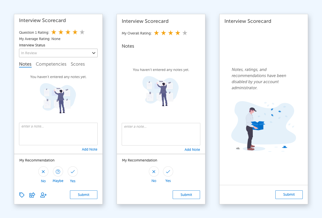
In the end, you are still able to sleep at night because you’ve performed countless rounds of user testing to ensure that the design is still meeting the minimum standards of usability that you established up front with the team.
