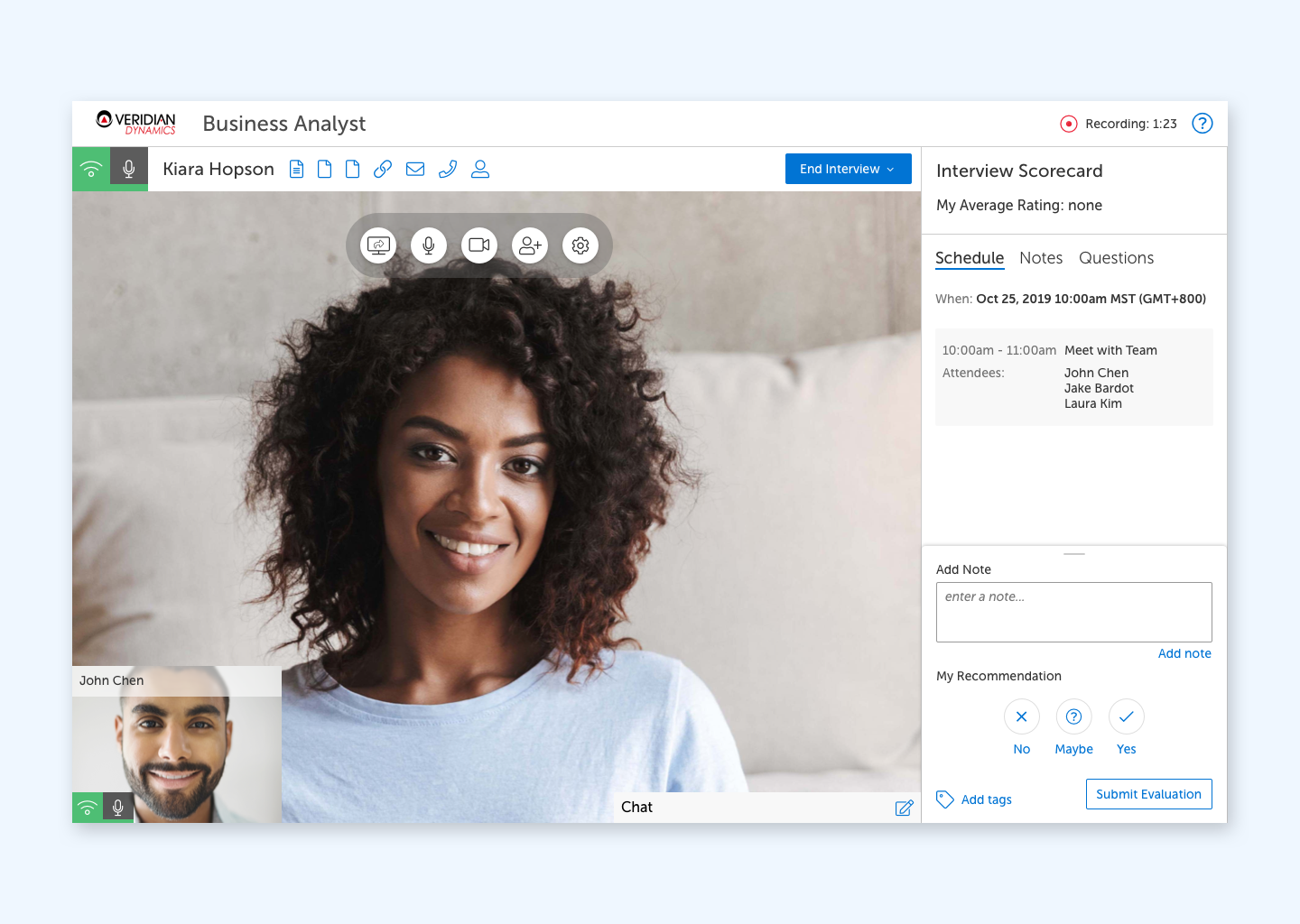
Live Interview Redesign
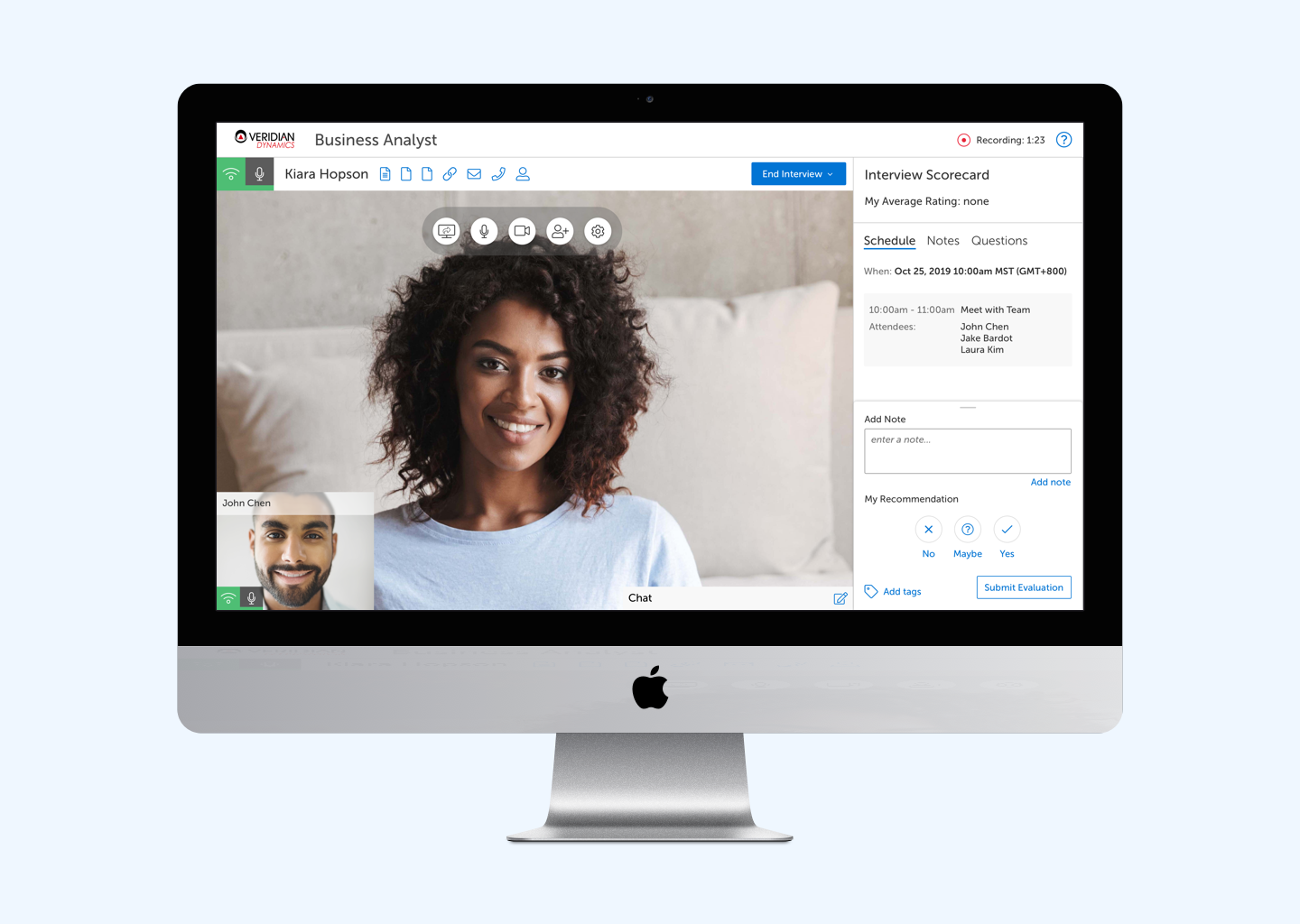
I had the chance to join the product team at HireVue, a company helping candidates applying for jobs to be more than just a resume by empowering them to tell their story as part of a video interview.
One of HireVue’s services is a live interviewing platform, similar to Zoom or Skype, but with additional tools and features specifically for aiding hiring managers during the interview process.
Here are some of the improvements we were able to make in 2020.
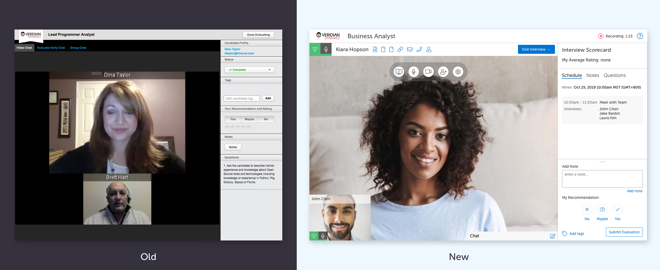
Perhaps the most obvious difference between the old and new design is the facelift given to the UI. Working with the design team, we created a new styleguide and component library to draw from. We focused on creating lighter visual elements that wouldn’t compete with the video streams for the users attention.
From there, I began to do research by interviewing hiring managers, recruiters and recuiter admins who were using this tool; watching recordings of past interviews; and talking with our support team to understand the most common issues they dealt with.
Join Status
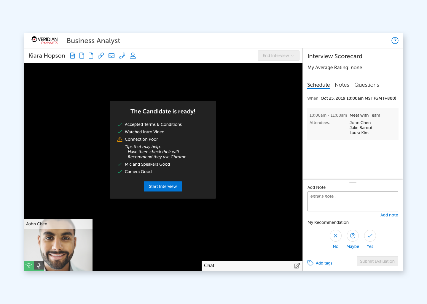
One of the most common problems that users experienced involved just getting an interview started successfully. Users would have technical difficulties joining. Sometimes either the candidate or the interviewer wouldn’t show up on time, or sometimes wouldn’t show up at all.
This led to a hypothesis that there was a lack of transparency and awareness around the join status of users.

To test this, we explored various ways of displaying a users progress while joining an interview. After several rounds of testing, we ended on the one pictured below. This version best accomplished our goal of informing without overwhelming users.
Notes
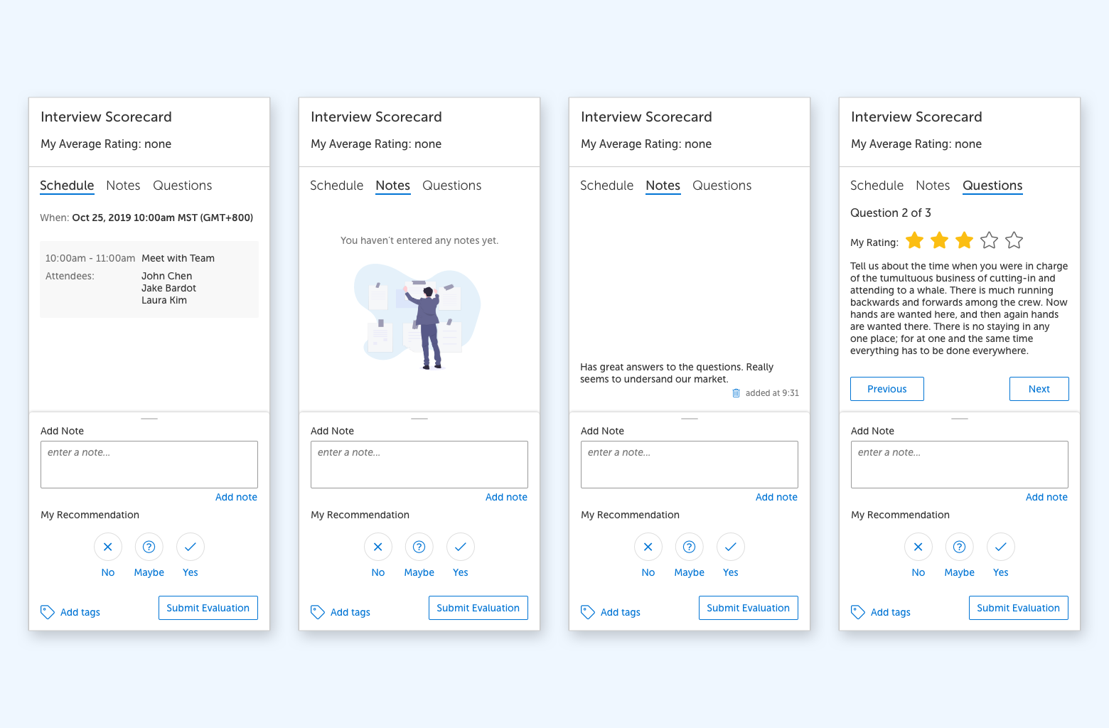
While reviewing recordings of interviews completed using the old tool, I noticed that users were struggling to enter notes while interviewing candidates. The old experience relied on having components all contained vertically in a panel which relied on an accordion behavior to open and close each component. In the new experience, we created a new panel that used a simple tab system combined with a persistent footer. The tabs allow the user to switch between different views more easily. The persistent footer provided an ever-present input field for notes so that interviewers could more easily add their thoughts as they came to them vs having to navigate to a different view each time.
Recommendations
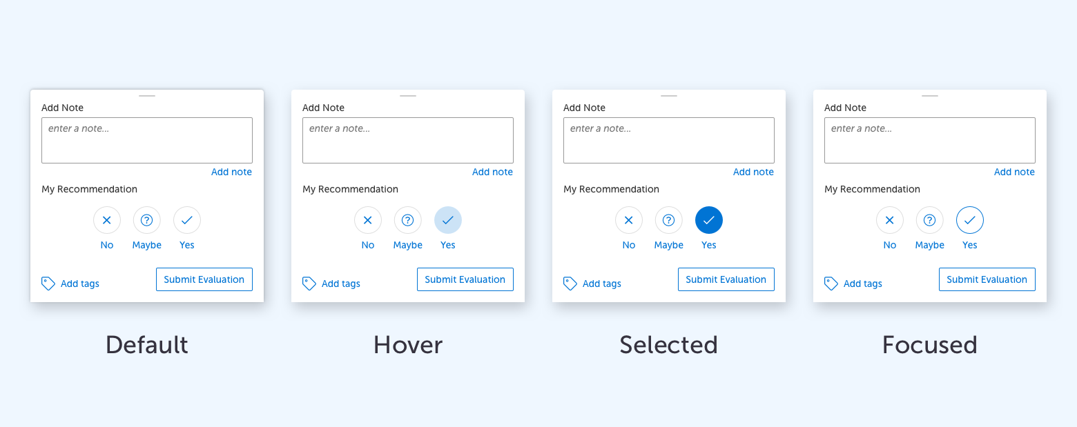
Another common action that was identified during our research was making a final recommendation regarding the candidate. This was found to be one of the most common actions taken during a live interview. As a result, we added the ability to do this as part of the persistent footer in the side panel. Wanting to create a pattern that would work equally well in the mobile version, I came up with a simple interaction that got rid of the standard dropdown component that allowed this to become a one-click action.
